Made by myself 🙂
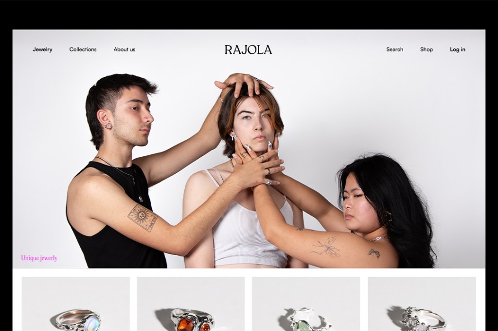
This project is a figurative brand design created for a jewerly brand based off the territory «unique jewerly».
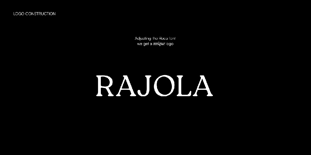
Rajola is a brand of unique jewels, this meaning that all the jewels it produces are single pieces, just one unit of each ever made. This is reflected in the brand in several ways.
First of all, the logotype is a unique adaptation of a font named Roca, since that’s were all the precious metals and gemstones come from.
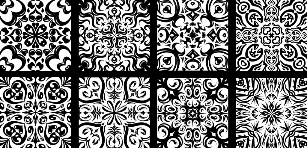
Also, all the brand has been influenced by Voronoi pattern, a kind of mathematical pattern found all over the nature (from giraffes’ necks and the sea foam to cells formations and bubble clusters). This Voronoi patterns are unique and irrepetible, just like the brand’s jewelry.
And lasf of all, a work of illustrations was also made. 8 different patterns based off 8 Greek characters. The thing of this is that each tile pattern can be separated in 3 parts (sides, corners & center); which can be rearanged with any of the other patterns in order to create up to 6561 different and unique patterns. Each of them would be stamped into a cloth handkerchief that would be tied to a jewel, both being unique.
Published on Behance.